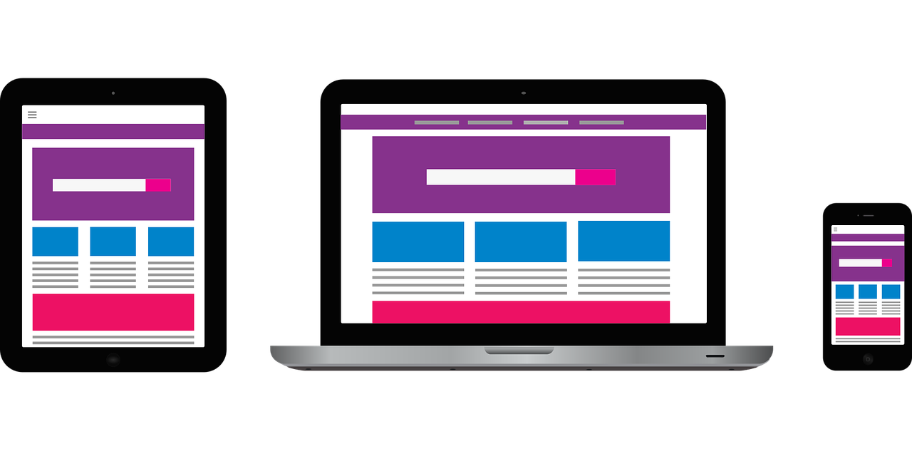
Best Principles of Effective Web Design
There are so many websites online that it is important to stand out from the crowd. There are many tips and techniques that can be used to achieve a better web design in order to achieve a greater flow of traffic. Of course it is worth bearing in mind that at the end of the day, it is the visitor who will determine whether the website is effective in its design or not. Badly designed websites, wont load properly and do not have a high viewer engagement. To try and better this, there are a number of techniques that can be used in order to improve the way a page is seen by the viewer.
What is the Purpose of the site?

When designing a new page the first thing to think about is its actually use. Websites will be designed differently if aiming to provide education, media files or an online shop. Every page within the site must have a clear objective so that users can navigate around the site reaching the required pages effectively and easily.
Learn to Communicate
In this day and age, everything needs to be done fast. Users want information and they want it now. This means that it is important that the website is designed in such a way that the information is easily accessible. This can be done by creating short bullet points of important points, making headings to draw attention to specific areas and writing in clear concise sentences. The font style and size that is used can also have a bearing on this. Certain fonts such as Arial are known to be easier to read while a size of 16 is usually perfect to cater to all eyesight.
Making it Colourful
 The colours used in the design of the site will also aid in the experience of the user. Complementary colours such as orange and blue or purple and yellow, create balance and are pleasing to the eye. Contrasting colours can be used to make a text stand out from a background so that readers don’t have to strain. Bright colours can be reserved for action buttons, as they will draw the uses attention to where it is needed whilst areas of white make the page look modern. Pictures too can aid in providing information. In fact often a picture is better than a long boring paragraph. These pictures should be placed carefully and should always be of high quality. Videos and infographics are other fun ways to gain audience interest and pass on information in a fun manner.
Getting Around
This last point is also one of the most important. Navigation needs to be easy. The layout of the site needs to be user-friendly and straightforward following a logical progression. There is a three-click rule which should be adhered to, meaning users should be able to find what they are looking for in three clicks. Confusing sites will only serve to drive customers away.
These are just some of the things that can be down to draw customers in and keep them. Other things such as fast loading times and mobile compatibility will also go a long way in attracting and retaining viewers.