Trends in Web Design 2017
The trends in web design are constantly changing, and it is important to be up to date with them. Even a couple years old design might already seem a little bit outdated. To keep up, you could constantly visit many different websites to make your own conclusion about what is going to be the next big thing. Or you could let someone else do that, and read their summaries of the latest trends.
Bold and chaotic
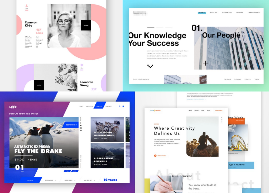
Sometime around last year, web designers got bored of the clean and simple. Out of boredom came creativeness and freedom. We could say that the shift has been happening from symmetric, light-colored minimalism towards an ostensibly chaotic and bold web design. The closed, static compositions are turning into open and asymmetric ones. More attention is paid to details and decorative elements, such as colors and background patterns.
“Lasting impression” seems to be the new “user-friendliness”.
Large typography
What is especially bold in the newest trends, is the typography. It is getting larger and more in-your-face – indeed an effective way to capture the visitor’s interest right when they enter the website.
Cinemagraphs and illustrations
Varied visual effect are clearly the thing for 2017. Cinemagraphs, meaning GIFs or videos, are getting more and more common, now that companies and web designers have realized the potential of a moving image to add some visual effect and movement to the website. It is also often more effective for content delivery than text, making a lasting impression in just a short amount of time. Along with a regular video, VR-like experiences are also slowly gaining popularity. This can be carried out through, for example, a game or a 360-degree video.
In addition to cinemagraphs and boldness in fonts, patterns and colors, illustrations can be a good way to add personality and playfulness without being too heavy or having to sacrifice any user-friendliness.
Responsive design
 Responsive web design might not be a new trend, but it is getting increasingly important. Responsive design means a flexible layout that readjusts to different screen resolutions and devices. People are more and more frequently using smartphones and tablets to visit websites, which is why a website designed only to fit a computer screen and a certain browser and resolution won’t cut it anymore. An intelligent use of CSS media queries is an important part of creating a responsive design.
Mobile-first approach has the same shift from computers to smaller devices behind it – since mobile devices are increasingly being used to visit websites, a lot of companies have decided to invest in the mobile design first, and only then concentrate on bigger screens.
Conclusion
What you want to be in 2017 is uninhibited and a little bit in-your-face. You now have all the freedom to get creative and make a bold, personal and interesting website.